


Fedora Workstation 34 is scheduled for release towards the end of April. Among the various changes that it will contain is the soon-to-be-released GNOME 40. This comes with a number of improvements and new features, most notably an updated Activities Overview design. Read on to hear the background behind those changes, and what to expect from the upcoming release!
What’s in a number?
In case anyone is wondering: yes, GNOME is changing its version schema for the upcoming release. The previous GNOME version schema gave stable releases even point numbers, like 3.32, 3.34 and 3.36. The last GNOME stable release is 3.38.
As the number of releases in the GNOME 3.x series increased, this approach has become unwieldy. It is therefore being replaced with a simpler schema where stable releases have their own major number. 40 will be followed by 41, 42, 43, and so on.
The new schema is starting at 40 because the next release will be GNOME’s 40th. This means that, going forward, the GNOME version number will indicate the number of stable releases that GNOME has produced.
While it might seem like a coincidence, the GNOME 40 version number is incidental to the overview design changes described here.
Why change the overview?
Okay, back to the Activities Overview! Before I talk about the changes themselves, I wanted to briefly touch on the motivations behind them.
One of these is that the overview hasn’t received much in the way of design updates since its introduction in 2011. Other aspects of the desktop have evolved (notifications, system status, unlock and login, to name some examples) but the overview hasn’t had much in the way of improvements.
Not only did the overview need a refresh, but a number of limitations in its design had become apparent over the years. The GNOME design and development team wanted to resolve these.
These limitations included the somewhat unhelpful blank boot state, the lack of coherent touchpad gestures, a sub-par app browsing experience, and the ambiguous nature of some overview elements, in particular the workspace switcher.
The goals for the upcoming release were, therefore, to give the overview a welcome refresh and address some longstanding issues, while keeping the basic design and essential features intact.
Design and development process
The new designs have been in the works for some time, with original conversations going back to around 2017. More recently, as the design has taken shape, a good deal of user research has taken place. These included exploratory interviews, a survey, user testing, and a diary study. These research exercises have fed into ongoing design work, helping to ensure that the design is attractive to both new and existing users.
There has also been an intensive testing program over the past month. VM images and a Copr were made available so that people can try the new design for themselves.
Those who are interested in this work can check out the research post on the GNOME Shell development blog.
Introducing the new overview
So what are the design changes? Most aspects of the GNOME desktop remain the same in Fedora Workstation 34. The top bar, search, notifications, shortcuts, system status are all largely unchanged. What has changed is the layout of the activities overview. As part of this, workspaces have switched orientation from vertical to horizontal.
This is what the initial overview looks like in the upcoming Fedora Workstation 34 beta:
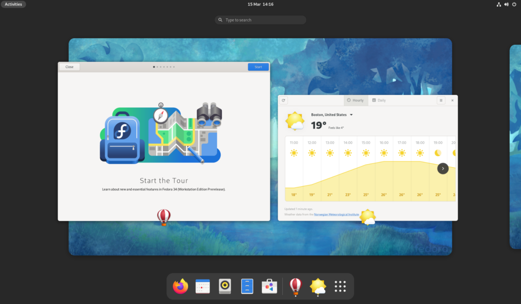
As before, search is central and at the top. Next there are the workspaces. These are arranged as a horizontal strip which can be panned left and right. Finally, there’s the dash at the bottom, which contains launchers for favorite and running apps.
When more workspaces are in use, a small “navigator” appears above the main workspace strip. This allows switching between workspaces (by clicking the small thumbnail). It is also a drop target when dragging windows out of the main workspace view.
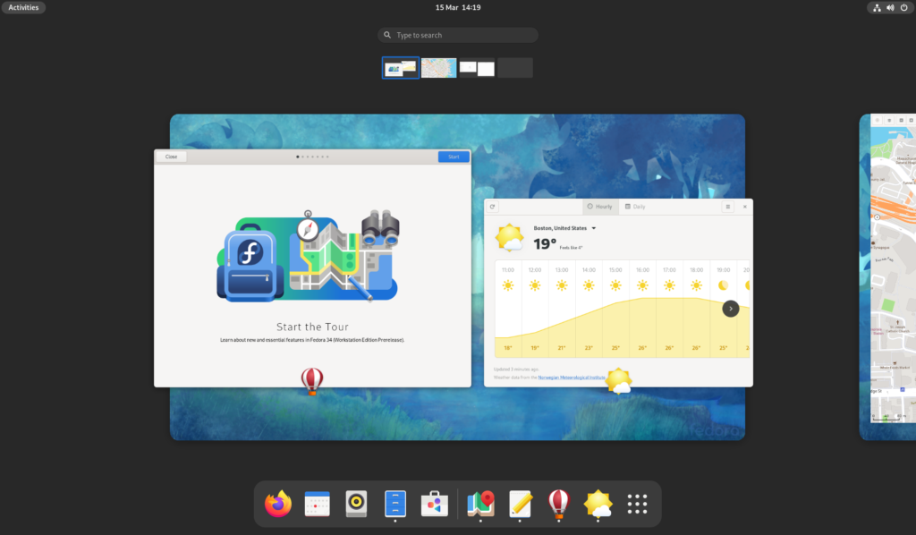
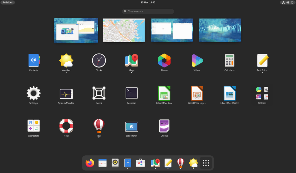
The second major part of the overview is the app grid. As before, access is via the grid button.
This is fairly similar to the previous version, though there are a few differences. First, workspace thumbnails appear above the app grid. These make it possible to see which workspace you are currently on, which is useful when launching apps. The second difference is improvements around app grid customization, including better drag and drop.
Check it out
The updated overview design will provide a refreshed look and feel to the desktop, some general improvements, and some new features. The new layout is better organized and easier to understand, the app grid is more customizable, and new gestures makes it easy to navigate the system with a touchpad. The boot state now also shows the overview by default, making it easier to get started.
There is also a collection of smaller improvements, including a better-organized dash, app icons that are shown over each window, and new shortcuts.
The new overview is a great reason to give Fedora Workstation 34 beta a spin and help out with testing. You can try a development version in a VM, either by upgrading from F33 or by installing a nightly compose. There’s also going to be test days running from 17-19 March, where we’re looking for volunteers to put the new design through its tracks.
Learn more
If you have more questions about the updated overview design, the GNOME Shell development blog contains a whole series of posts with information about the design and development process, as well as how the new design works.

Bryce Carson
I’ve been using the Gnome 40 Copr from haeckerfelix for a few weeks. It’s pretty great! I haven’t encountered any major issues, but only one annoyance (which is subject to the Copr, I believe).
The test days starting Wednesday sound great! I might upgrade my system and continue testing on bare metal.
How do I contribute bug reports to the QA that the testing days serve?
Breno
I’m always excited about big UI changes and this one looks great! Congrats to all of you involved in the new GNOME version and Fedora 🙂
svsv sarma
Fedora 34 is good news but I could not bring myself to use Gnome for long! Why should it be odd? With top and bottom occupied, the screen view is restricted. But it is official version! I hope Gnome 40 is different and more acceptable.
Hossam Elbadissi
The dash in the bottom is not shown unless you’re in the activities overview. Also what Fedora didn’t include yet are new revamped icons that are already available on GNOME OS nightlies.
Пердёжник
What about translations in gnome 4.0 for fedora 34? Are they still broken like in 33 fedora ?
Bimo Kriatianto Nugroho
i’ve been try it on my fedora 34, its actualy verry good with wayland, the touchpad works great, but when using xorg-x11, the pointer settings didnt works well, i cant turn off the touchpad, the gestures must be setting manualy by editting /etc/X11/.
But overall is great, Thanks to community for hard working 🙂
Ludovic
Hi everybody!
I would like to test Fedora Rawhide (or Fedora 34) on bare metal.
So I have two questions :
Is it “safer” to test Fedora Rawhide on Silverblue than on Workstation thanks to its immutable system?
If yes, is it still worth to use Silverblue even if we have an Nvidia graphic card and we want to use the proprietary driver?
Therefore, the operating system will then no longer be in its “factory state”
Thanks for this great article.
Walter
Great re-design! I love using Gnome, and this idea of a huge change had me worried. I tried a live beta version and it is fantastic. Thank you for making Fedora awesome!
Thijs
Sorry for being negative, but why is the bar with application shortcuts moved to the bottom of the screen? On the left side, close to the activities hot corner, is the perfect place for that. On a wide screen, something very general, such as opening an often used application, should not be 3 mouse pad swipes away from the place where you open the launcher.
AlexB
I’ve been running it in a VM for weeks now and the tiny workspace switcher at the top are too small and cramped looking. Had the dash been on the left no problem. They could shrink the overview I guess. Personally, sorry to be negative, but all these changes to a horizontal workflow don’t anything for desktop users, only tablets and phones.
I hope it was worth it, but to me it is just different, not better. I don’t use the activities overview anyway, just shortcuts and type to search, so either way I am not so bothered.
GNOME designers certainly created a lot of work for other distros, such as Ubunu,
if they want to maintain their current layout, that’s for sure.
oldkid
I second this. App bar on the left is much better than other systems’ designs, namely, MacOS. You casually throw the cursor toward the top left direction, you see the quick apps; if you don’t find what you need, you click the launcher and it’s already near your cursor. IMO MacOS’ dash looks very weird, it takes quite a bit space and it’s not even full. The left and right empty space is completely wasted, although Gonme 4’s only appears in activity, but why does Gnome imitate that design anyway?
Mark
I’m glad Hossam mentioned the icon display at the bottom is only shown if you are in the activities overview; the bottom of my screens are already populated.
I wonder how many gnome shell extensions will be tested for this new release, almost everyone still using gnome will be using extensions of some sort to re-create functionality dropped from gnome as it went through prior releases. I would guess most will break, based on the first sentence of this post…
…
“Fedora Workstation 34 is scheduled for release towards the end of April. Among the various changes that it will contain is the soon-to-be-released GNOME 40
…
I’m guessing as it is Fedora even if gnome 40 is not ‘released’ by the F34 release date it will still be included in F34 simply because fedora is for testing things. That could be interesting.
Julian
In Fedora 33 std with Wayland, when you ssh -X from a client computer, windowed applications appear in the host computer instead of in the client. One has to switch to GNOME on Xorg to make it work correctly. Is it going to be fixed in version 33?
FlexibleToast
Have you created a bug report for it?
Julian
I found out that Wayland SSH hosts require the preset string GDK_BACKEND=x11. There is a comprehensive answer to this question here: https://www.dbts-analytics.com/notesxfwdgb.html
Sebastiaan Franken
This is neither a Fedora nor a GNOME issue. That’s with SSH and X forwarding, and Wayland not supporting it (since Wayland isn’t X)
Julian
Actually, it turned out that it does. See my answer to FlexibleToast.
gitusr
Top bar is not very useful in gnome, it should be made, part of the wallpaper , so as to provide more screen space.
cpk
Almost all screens I can think of are rectangular and it would therefore make sense to leave the dash on the side, or at least let the user decide where it should be. Also, I hope there is a default icon tray on the top bar of currently running programs.
Andrey
Cool, I like it, I think I’ll try it!
Andrii
Umm… I think I’ll wait until the release is not stable. But it was interesting!
lemc
As one reader commented, because monitors have more horizontal space, it makes more sense to leave the dash where it is now, i.e., to the left. A dash at the bottom only makes the desktop more mac-like, at the expense of shortening the space available for the workspace selector. Please at least add an option, possibly in Tweaks, for the user select the position of the dash.
Lothar Scholz
I really want it at the bottom because there is more space. I have so many apps bookmarked that i almost want desktop items back.
Benjamin
Many commenters see the move of the dash to the bottom of the screen as an unwise change.
While I personally agree — since I very rarely use it; on a desktop, my keyboard is by far my primary and favored mean of control to open apps, switch and move around workspaces — I also understand many users have different preferences, skills and experience.
I see how my coworkers use their devices, and I’m sure they’ll feel much more at ease with this bottom “mac-like” dashboard. I think it’s a nice move to welcome and engage new comers to Gnome Desktop environments and Linux alike as a workstation.
And if I personally don’t like it, and if there is no easy option to put it back on the left, and if no one already made an extension to do so… and all of that sounds very unlikely… well, why not building my own extension then? 🙂
Dennis
would be pretty awesome if you could select Fedora 34 from Gnome Boxes by default
Joe Pesco
I’m looking forward to getting Gnome 40 off the ground in the next release of Fedora!
Michalis
For me Gnome is ok, sometimes even great!
I don’t use it right now but I am certain, I will use it in the near future. I am taking turns between KDE and Gnome and right now I am on KDE.
I installed and checked a beta of the new 40 version briefly by enabling a Copr.
It seemed pretty stable and usable.
I also wanted to check if I could use “Dash to Dock”. I couldn’t, but at this point is expected. Probably later…
Over the years, Gnome “grew” on me and (mostly) put at rest a really annoying feelling that everything was forced on the user without making an effort and seek our feedback.
Reading about the process the developers went through to understand and code the new overview I was excited that, this time, really our feedback had something to do with this change. Time will tell.
Right now I am happy that a new version of Fedora is right behind the corner.
Ian F
Will there be a spin of Fedora 34 made with the GNOME 3.38 shell?
Aaron
I just recently returned to fedora when fedora 33 was released. Love the distro, but I’m a GNOME2 guy. I really hate GNOME 3, its just not usable to me. And now it just appears people are trying to make it look like a MAC, which I also find displeasing. Fortunately its easy to install Cinnamon which definitely feels lighter weight and launches faster. The nice thing is with the newer drives I have enough space to run both – which of course is the cool thing about opensource and Linux. Each person can tailor their own system to their own personal preference.
aa
Switch session to Gnome Classic. Or tweak the default Gnome. All you need is Tweak Tools. Add Program menu and bottom taskbar. You don’t have to use Activities. I actually just press “Windows” key, type first letters of what I want and Enter. Much faster than mouse.
russ baker
Gnome 40 test day: error msg is system will not be bootable, may be kernel or firmware bug. Test machine is a core 2 duo at 2.53ghz, GD6000 notebook. From live source, only had two work pages. Software installed showed only gnome apps. On same machine, rawhide and silver blue ran with no problems.
russ
Somewhat later, changed bios to allow legacy boot. Fedora 34 w/ Gnome 40 now installed and is running hot, straight, and normal. Still have only two workspaces.
Benson
I’m looking forward to Gnome 40 and Fedora 34.
I used to be an openbox user, but since the early Gnome Shell days that has been my only desktop. I have overpowered hardware for my needs (which more or less is Gmail and a thousand spreadsheets open).
Gnome gets out of my way, it works out of the box, it’s simple. Maybe I’m getting old but I just want a desktop that works and for me that has been Fedora + Gnome Shell.
Whatever changes they make I’ll adapt to 🙂
Jeff V
Activities at the far top left of the screen then the buttons on the favoirites bar across the bottom middle of the screen is really frustrating and a lot of mouse movement to reach the others.
The favorites menu should remain at the left side of the screen, and those using tablets should have the option to move it if they choose.
Forcing those sitting at a terminal to make that large a screen traversal to open one of our favorite apps is not at all encouraging. It is also very stressful for those of us with carpal tunnel or other ergonomic problems.
penguinx86
I never liked Gnome 3. Gnome 3 is why I quit using Ubuntu and switched to Linux Mint with my choice of MATE, Cinnamon and Xfce. Now I’m trying Fedora 34 beta with Gnome 40. It fixes a lot of the problems I had with Gnome 3. Thank you for making Gnome NORMAL again!
Andrew Malcolmson
I keep as many of five workspaces open and rely as on the existing vertical preview strip to identify and switch between them. With the new switcher being much smaller, I can’t see what’s in a workspace before switching or dragging a winder there. We need to be able to label workspaces like under Under Windows 10.
chdslv
How can one configure the touchpad gestures? How to add 2-finger pinch, 3 or 4-finger pinch, 4-finger swipe – up, down, left, right?