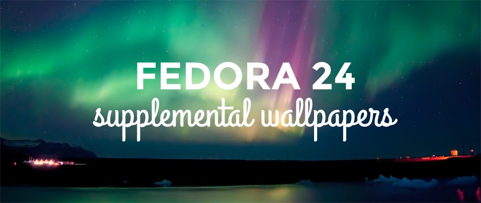
In the Fedora 24 alpha release, you could preview an early version of the default wallpaper for Fedora 24. Each release, the Fedora Design team collaborates with the Fedora community to release a set of 16 additional backgrounds to install and use on Fedora. The Fedora Design team takes submissions from the wider community, then votes on the top 16 to include in the next release.
Voting is now closed on the supplemental wallpapers for Fedora 24. The results are available for all to see on the wallpaper voting app. In the Fedora 24 cycle, the Fedora Design team received 133 valid submissions from many existing and new contributors to supplemental wallpapers.
Take a look at Fedora 24 wallpapers
Out of the 133 submissions, the following 16 wallpapers were chosen for inclusion in Fedora 24:
- Aurora over Iceland by Helena Bartosova — CC-BY-SA
- Sunrise in Florida II by afsilva — CC-BY-SA
- Lady Musgrave Blue by Lyle Wang — CC-BY-SA
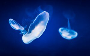
- jellyfish by Allan Lyngby Lassen — CC-BY-SA
- old railroad by nask0 — CC-BY-SA
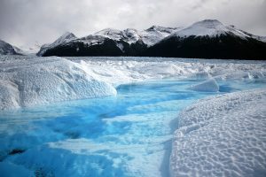
- Argentina Glacier by wesleyotugo — CC0
- Iceberg in greenland by lhirlimann — CC-BY-SA
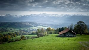
- Paisaje by diegoestrada — CC0
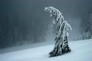
- Tree in Winter by Franz Dietrich — CC-BY-SA
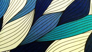
- waves by ali4129 — CC-BY-SA
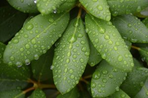
- Morning Dew on Leaves by sethtrei — CC-BY-SA
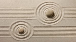
- zen by hhlp — CC-BY-SA
- Blue Deep by alyaj2a — Free Art
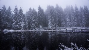
- By the lake — CC0
- mistogan by espasmo — CC0
- Ice Lake by Oscar Osta –CC-BY-SA









joe pesco
One second, I like these. Yes, I do like these.
antikythera
indeed, nice selection, well done folks. it was tough choosing this year however a few of my choices made the final 16 so I’m happy to see them there.
Mclong
Very nice selection. Looking forward to using them with Fedora 24.
Charlie FG
That zen rock garden might shift me away from fractals for a while. They’re all superb though, nice range of themes.
Ana Mativi
Beautiful selection! So many great pictures, I could pick more than 16. My submission ended up being in 17th place, I’ll try again for Fedora 25 🙂
antikythera
It’s a shame you missed by one spot. I’ve downloaded a few more that won’t be packaged up including yours because I prefer landscape type shots. it’s a great image so please do try again next time round. One of mine didn’t quite make the grade either (submitted as arehtykitna). It’s fantastic to be so spoilt for choice with image submissions though so I don’t mind 😀
Sirko Kemter
yeah, nice to hear you will try again. As you can see I had yours amongst my favorites in the communityblog article.
Vineet Tuli
Congrats to all the winners…..
And a very good final collection ….. Eagerly waiting for the Fedora 24 Release..:-)
Wesley Otugo
I made it through on my first submission, hahahahahahahaha. I was worried on how the user may find it when using desktop icons with text font as white, but this proves it nobody uses desktop icons.
antikythera
well done, it’s easy enough to change icon text colour anyhow 😉
Sirko Kemter
Congratulations. There is a little bit luck in the game (unfortunately), as many of the voters have not that many experience in design, they just choose what they like out of their belly. In your case the nice glacier, which is bluish a big plus for many voters 😉
I hope you contributing next time to, even you could have not luck again
Mohammad Mahdi Ramezanpour
Very nice! Looking forward to use the Aurora one on my machine.
Vlad
Super. Loving the nature shots.