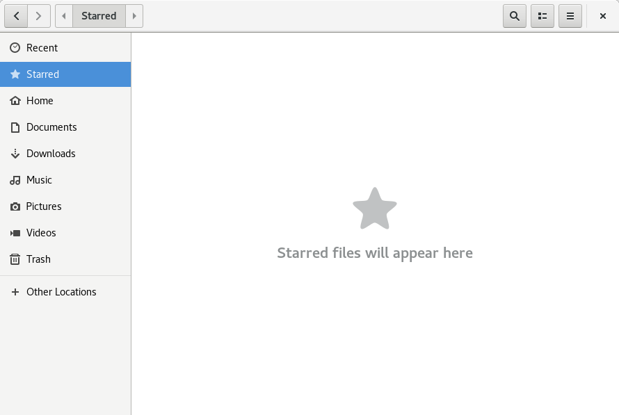
Files is an essential application in the GNOME desktop. Many users interact with it daily to navigate, find and open files. Here are some changes in GNOME 3.28 users will see in the Fedora 28 release.
Upcoming features in Files
Each release cycle, GNOME community members improve and enhance the user experience with design and development efforts. For instance, GNOME 3.28 introduces the ability to “star” or favorite files and folders. These starred files are quickly accessible through the sidebar.
The roadmap of new features and improvements also includes significant architectural rewrites. Notably, these changes will improve search performance, so a heavy search does not cause the application to lock up. This new “backend” to Files has other benefits too, including the ability to pause copy and move operations.
Along with performance improvements, new file views are under development. This includes a “flow view” that dynamically adjusts icon spacing when you resize a window. All these improvements are the result of difficult decisions and hard work by developers over the past few months.
Whither desktop icons?
For years, Files has supported the ability to not only browse files in a window, but also add icons to the background of the user workspace (the desktop). However, the concept of desktop icons was never part of the GNOME 3 design. The default GNOME experience has disabled these icons since its release about 6 years ago. As a result, the code that enabled desktop icons has been mostly unmaintained for over 6 years.
About two years ago, the development team did work to preserve desktop icon behavior by isolating it from the main Files application. This was only partially successful. It allowed desktop icon support to remain, but in a poor state. In the meantime, security features like process sandboxing and Wayland’s architecture of process isolation have been introduced.
This means developers can’t acceptably maintain the desktop icon experience in an application that is not the desktop compositor. If you’re curious, you can find a list of technical challenges the team faced on the GNOME development team’s issue tracker. As a result, the development team decided to remove the desktop icon code inside the Files application.
Workarounds for desktop icon lovers
Fedora ships the default GNOME desktop experience. However, desktop icons are a fundamental use case for many traditional desktop users. The Files developers have proposed a few options to find an acceptable, alternative solution to desktop icons.
The long-term solution is to change desktop icons into a GNOME Shell extension. This neatly solves the ownership challenges since GNOME Shell is the compositor. It also opens the door to a much better desktop icon workflow.
A prototype is available today, and already solves one of Files’ longest outstanding bugs: multi-monitor support. Community contribution to the extension is encouraged. You’ll find a list of suggested features on the extension project’s first issue.
The GNOME Shell extension is still in a very early stage and not shipping in GNOME or Fedora yet. For an immediate, short-term solution, users can install the nemo-desktop file manager and set it up to autostart on login. (Read directions for that here.) Desktop icons are an active part of the Cinnamon user experience. As a result, nemo-desktop actually provides a more feature-rich desktop than Files does today.


crossingtheair.wordpress.com
I found an acceptable alternative solution: using another desktop.
Nevertheless, this is a good article and it’s always interesting to see what’s new on Fedora’s default.
Thanks!
Erik
Good info.
I would also really welcome the ability to put icons in different application categories in Gnome (and other desktop managers).
Umayanga
It’s OK not to use desktop icons. But there must be a dock in the default GNOME.
As an example, If you wanna open Files, you must click “activities” and then click Files in the dash. There are at least two steps if you don’t open apps using keyboard shortcuts.
WTF is that ????
Almost everyone install Dash-to-dock or Dash-to-panel. So why GNOME doesn’t come with a dock in default?
Ivan Augusto
+1
liam
Alternatively, and quicker, you press the Super key and then start typing F I L E S until the shell selects that app then press enter.
Though I do agree thatb the dock extension Soros be installed (though not enabled) by default, getting the extension isn’t difficult.
I’ve still not seen a convincing argument about what usability gains are had by removing them.
Dann Griggs
“… dock extension Soros be installed (though not enabled) by default, getting the extension isn’t difficult”
Actually, seems to be. Googling “gnome soros” and “gnome soros extension” brings up no relevant results, and extensions.gnome.org also doesn’t have any records of an extension named soros. I’m curious to look into what it adds, might want to install it. Can’t find it, though.
liam
Errr, sorry, that was a typo????
s/Soros/should/
Gboard has been very frustrating lately ????
@Zac
I personally like the hiding dock, applications drop down, and super key.
I like the hiding dock because I value my screen real-estate and would rather make more space available to those programs. This is why I would rather not have a permanent dock taking up space.
I also really like the super key feature, its simple to access and I can easily access the search bar or app menu for any not on the dock that appears when pressed.
Currently using F27, and love that it comes basic and allows people to customize it as they see fit with different things they can install. So people above can set their computers the way they want it without it affecting other uses that prefer not to have those features.
From a design perspective, I imagine keeping things basic and allowing people to customize with addon’s is probably a better long term strategy than adding bells and whistles that end up doing two things, (1) increases the size of the OS, and (2) over extends labor and resources required to meet the insatiable customized wants, that may change over time.
Therefore, I’m in full support of this continued effort NOT to try to appease every additional feature request in the base OS, and to leave this effort to addons.
To all those developers on the project, Thanks for a great product and hard work.
madmax
I’m one of those keyboard junkies and find that much easier and faster than hunting for an icon in a dock. I don’t have Dash-to-dock nor Dash-to-panel, even though before GNOME 3 I did have my most used applications in the panel.
You don’t need to click Activities. I never do. You can press the Super key, as liam pointed out or, for a keyboard-averse, launch the pointer to the top left corner with no care for precision.
In my case, I don’t even go to the Activities view to launch common apps like Files, Gedit or Terminal. Go to Settings, Keyboard, add and add a keyboard shortcut for them. I just press Super+E (muscle memory that also works for MS Windows) when I need a new Files window.
I don’t know how representative I am, and of course I’m not saying things should be difficult for point-and-click people, I’m just chiming in thanking for the fast way for keyboard people.
Mario Aria
“Almost everyone install Dash-to-dock or Dash-to-panel.”
I don’t.
Bryon
Searching is a pain point for me, I’m glad it is getting some love. I’m used to just typing a file name and being brought to it automatically without waiting for a search in Windows.
@Zac
@Byron,
I believe this works exactly the same way in F27, as it does in Windows 7 and 10. You can hit the super key and just start typing.
Bryon
Searching works differently. In GNOME Files, it searches. In Windows it immediately navigates there as if you scrolled down and clicked it, it highlights the folder so you can just hit enter to view the folder. It’s a little slower since it’s searching but it’s not bad, just different.
Leslie Satenstein
I have been using Gnome for almost 10 years. When I installed the beta, I created some new xxx.desktop files. One to try and replace the desktop files.
But then I found another Fedora graphical interface and adopted that one. Perhaps Gnome 3.30 will encourage my return. I will check it out when it appears for testing.
Steven
Well, as I personally don’t like the clutter of multiple Icons on my desktop(s), I welcome this since it will likely have no to little effect on the way I use my PC which runs Fedora. I understand their (Gnomes’) need to eliminate the legacy and largely unsupported portion of the desktop code. I would also bet there will be alternative solutions that will come from the community, to replace that which is seen as missed.
John
I used to need deskptop icons but found that to be messy. I organized them into links in Files and Places at the top left. No more moving windows around to find an icon. Glad to see things moving to being extension, letting the user decide what features they want.
code78
Amazing radical moves… upgraded notebook f27 -> f28 and no desktop icons. I don’t “love” icons but those are quite much speeding up my work. I’ve been using redhat since mother’s day release to fedora but I’m considering to give up with fedora due too radical changes and mostly publishing quite much not finished distributions. I know I can get those back even if I would need to do code by myself but I’m quite much done with “hacking os”, nowdays I would like to just use stable steady OS but fedora has failed on that. Debian is a bit too slow motions but maybe Buguntu ? or even developing own distro :p Just gonna take a very long deep breath while considering upgrading my desktop pc to Fedora 28 or something else…
lemc
One feature I miss in Files is that it does not always show the full date/time stamp of files. I really don’t like a date/time stamp showing simply as “Yesterday”, or just the time. There should be an option to always show the full date/time stamp, which is the usual behavior of other file managers. This option should be available either in Files’ own Preferences, or via Dconf-editor.