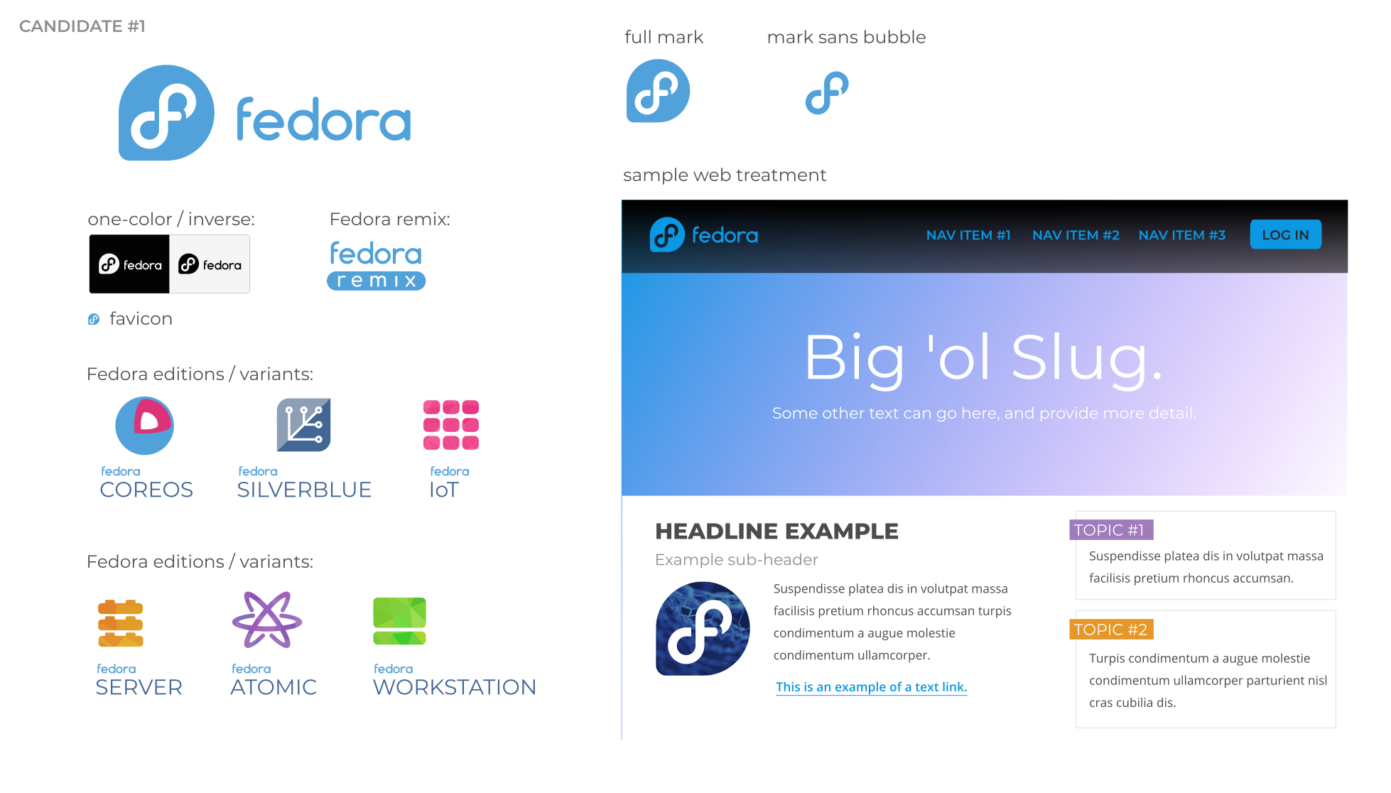
The current Fedora Logo has been used by Fedora and the Fedora Community since 2005. However, over the past few months, Máirín Duffy and the Fedora Design team, along with the wider Fedora community have been working on redesigning the Fedora logo.
Far from being just an arbitrary logo change, this process is being undertaken to solve a number of issues encountered with the current logo. Some of the issues with the current logo include the lack of a single colour variant, and, consequently the logo not working well on dark backgrounds. Other challenges with the current logo is confusion with other well-known brands, and the use of a proprietary font.
The new Fedora Logo design process
Last month, Máirín posted an amazing article about the history of the Fedora logo, a detailed analysis of the challenges with the current logo, and a proposal of two candidates. A wide ranging discussion with the Fedora community followed, including input from Matt Muñoz, the designer of the current Fedora logo. After the discussions, the following candidate was chosen for further iteration:

In a follow-up post this week, Máirín summarizes the discussions and critiques that took place around the initial proposal, and details the iterations that took place as a result.
After all the discussions and iterations, the following 3 candidates are where the team is currently at:

Join the discussion on the redesign over at Máirín’s blog, and be sure to read the initial post to get the full story on the process undertaken to get to this point.


Martin
Same same, but different, but still same.
NaN
I should be a little embarrassed that I know this reference.
Andrew Ward
Impressive, I do like the new design, keeps those who think its Facebook from misidentifying us as well
Qlogic
@Andrew Ward said it. My thoughts exactly.
“… keeps those who think its Facebook from misidentifying us as well”
svsv sarma
It is #2 for me. The f looks vertical and prominent with smaller bottom tail. Merging with the infinity is critical. A different color or a cut for the infinity would have helped.
Anonymous Fedora User
The “mark sans bubble” logo looks indistinguishable from generic icons for hyperlinking text that rich text and various document editors use.
sergio supelano
Ilike the color blue in the old logo this blue for the new fedora’s logo is same blue of the windows 10 .
jakfrost
It’s actually not the same blue. If you see it the same, your monitor needs calbrating for colour correction.
Ezan Kacou
It looks good! You guys keep up the good work!
tutunak
The second candidate is the best.
Carl Bennett
The new logo design isn’t appealing to me, but I do agree Fedora needs to disambiguate from Facebook’s logo. Wearing a Fedora t-shirt to work caused people to ask me why I was wearing a Facebook t-shirt and when I corrected them they’d just laugh. I was bullied over it and got called into Human Resources. The logo design team is on the right track but this new logo doesn’t feel right.
Balthazar
This is not Fedora who has a logo which looks like Facebook’s one, but Facebook’s logo which looks like Fedora’s one.
Fedora was there before Facebook.
Matthew Miller
Yeah, Facebook claims first use for their ‘F’ in October 2006. You can see the Fedora logo in use in the Fedora Core 5 wallpaper in March of 2006, and you can see an early version as a menu icon in this Fedora Core 4 screenshot.
But that said, for whatever incomprehensible reason, Facebook is a household name worldwide, and Fedora still has some work to do. 🙂
Yadomin
#2 is much better.
Balthazar
But why redesigning this logo ?
The actual is really nice and is an important part of the Fedora identity.
aaaa
Sorry, but I prefer the existing logo. Windows 10 sucks, don’t follow their monochrome fad.
Simon Morgan
Much of a muchness. That said, I love it. Great evolution in colour.
Dan Jones
So, you’re turning the “f” into an infinity symbol? I don’t see this as an improvement.
Andrew
The original logo is an infinity symbol
Vaclav
Second variant looks very nice and polished, except the color. This particular shade of blue is absolutely disgusting 🙁
William Morttey
It looks nice; if I could suggest, I think the tail of the ‘f’ or the background should be in ‘Red’ ink
Brenda Jackson
It needs to have a FEDORA HAT !!!!!
Bodhi
It looks the same to me as well, and I do not see more than one color scheme…..
It is such a minor change I am not sure it is worth the effort or the hype
Amod Ajit Karmarkar
Not a good idea of Breaking the Infinity ?? My persona opinion anyway
Anil
plz, keep the old infinity, but with a different colour scheme. that infinity & f construction is a genius design
bookwar
I like the logo with balanced infinity symbol.
But I’d ask to reconsider the color choice.
I personally always associated Fedora with the deep and rich blue color, with space-like or underwater-like curiosity.
This light version looks, well,.. light and shallow, it doesn’t have that feel anymore.
And this color is not really visible on bright white background. (While yes, my monitor probably needs calibration and/or brightness adjustments, but how many of “ordinary” users like me are going to actually configure their screens to see Fedora logo properly?)
Carlos
Comments in Mairin blog are closed so I’m going to post my idea here. I think that the cut at the left of f middle bar in candidate #2 should be an straight cut, like in candidate #1. The reason is that I think if the gap is rounded as it is now, it may give the impression that this point is the start of the symbol, when I think it would be better if the visual effect were that this line is crossing the vertical line of the f/infinity from bellow, and then reappears at the crossbar, and just next comes the round gap, which symbolizes the f.
I think that this change could add a bit of 3d effect and continuity to the logo. I think that continuity is good when representing the infinity symbol as it’s a thing whith no start nor end.
Mirza
Hi there, I am an ordinary computer user and I use Fedora. I suggest adding OS in the name and logo too.
John Harris
Fedora is a distribution, not an operating system. Specifically, Fedora is a distribution of the GNU operating system on the Linux kernel. Fedora has a few sub-projects, such as Silverblue, which is a separate distribution based on flatpacks and ostree.
Kris
“I am actually not sure which version of the mark to move forward with, but I suspect it will be from the #3-#4-#5 set.” — quoted from Máirín’s blog
I think that #4 looks less like an 8. I remember hearing about the infinity symbol
‘way back when’, however I think the logo was introduced at (about) Fedora 8, so it could cause some confusion. I also think the criticism of the rounded cut on the lower loop not looking like infinity is valid. That being said, I think I would ‘like’ #4 with a square cut . . . for what it’s worth.
Thijs
I just bought some fedora logo stickers for on my laptop. XD
pawa
what about considering putting emphasis on the infinity sign, at the same time, not having lost the readable form of the ‘F’ letter, which has been connecting users’ minds with fedora brand?
i’ve tried doing that by playing with colors, i.e. inverting them: white -> blue , blue -> white, though leaving white outline
Edward G OConnor Jr
I prefer the second candidate?….it looks “even” to me…..not a “swollen” bottom half of the “f”. But that could just be my eyes!…LoL!