


Fedora 22 Workstation will include the new GNOME 3.16 release. This release has a new notification design that’s less intrusive and easier to use.
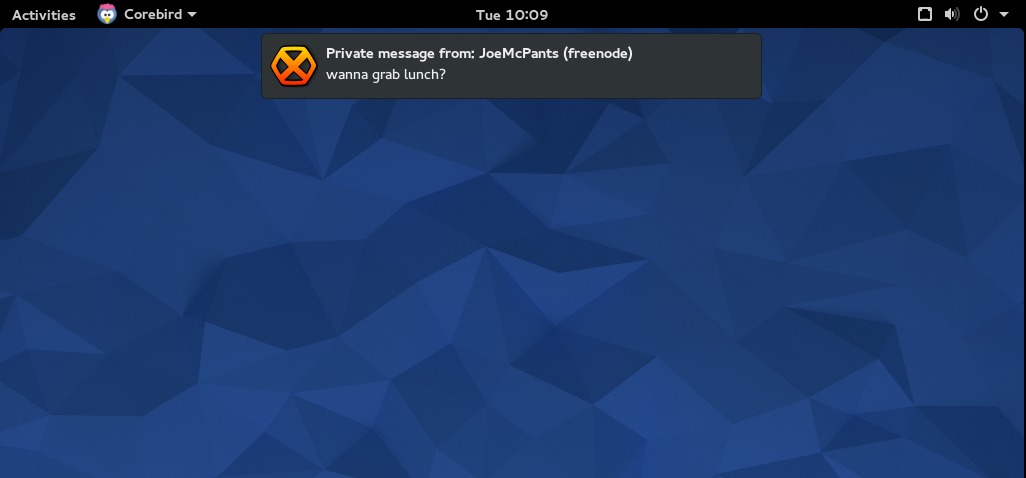
Notifications now pop up from the middle of the GNOME top bar. Many types of notifications allow you to take action immediately through the pop-up balloon. For example, when your storage device is low on space, you can choose to examine the area that’s full, or ignore the warning directly from the notification.
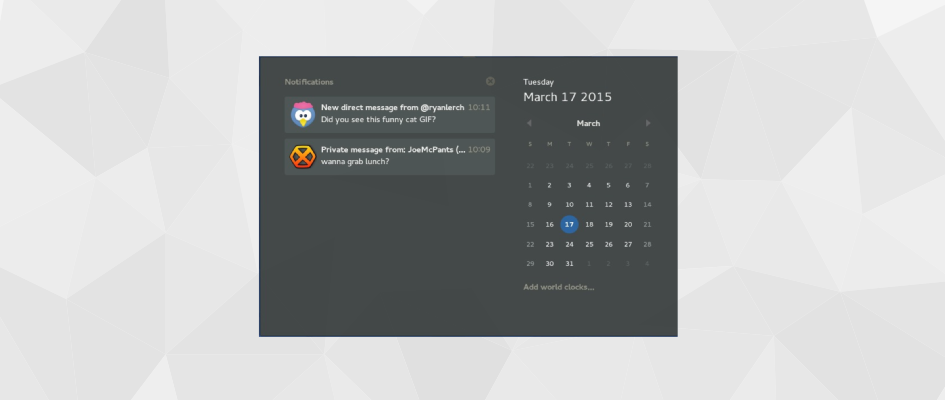
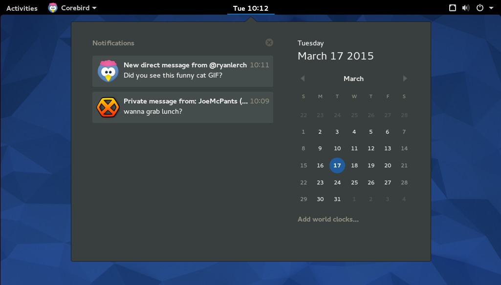
If you’re away from the computer for a while, you might have more than one notification queued up for your attention. In this case, a prominent dot marker appears next to the clock in the top bar. You can select the clock in two ways: either click it with the mouse, or use your Super+M key. (The “Super” key usually has a logo on it, and is sometimes called the Win key.)
When you select the clock, you’ll see a list of the most recent notifications for each app. You can clear them individually, or you can clear an entire list of notifications from an app at one time. If you’re using a keyboard, you can use the Up and Down arrows to move around the notifications,
Of course, this is a fairly big change. Notifications used to be in a popup tray at the bottom of the screen in previous GNOME and Fedora releases. That tray also contained controls for apps using the old status icon feature.
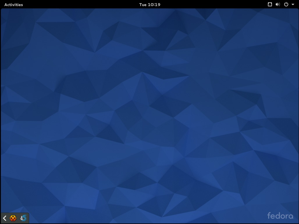
Don’t worry, those apps are still there for now. If you go to the bottom left of your screen, there’s a sliding tray that contains old status icon type apps. So for instance, if you’re using something like Google Music Manager, you’ll find it in this slider. This may not be the long-term solution for these apps, but rather a stopgap you’ll see in Fedora 22 while designers come up with a better solution.
The new notification system will allow you to stay focused on your work, but also makes messages from your apps easy to find. It’s another of the helpful improvements you’ll find in Fedora 22 Workstation. The Fedora 22 release is currently scheduled for mid-May.
Krystian
Upper notifications will be good and bad. Bad, because it may cover sometimes something just below upper bar.
On the other side – bellow notifications was neutral, but can be missable sometimes.
Using GNOME 3 is unsatisfactory sometimes – you get used to something and boom, revolution chasing revolutions, get used to something and again revolutions… It’s strange that GNOME-devs not crystallized final design after this few years (KDE yes and even going to KDE 5).
Alain
Let me get this straight. You have the notificacions up in the middle, and to see all of them you have to go down to the left.
Not sure if that’s user friendly.
Ryan Lerch
The tray in the bottom left corner is for the old legacy “status icons” that some applications still use. The notifications themselves are displayed at the top and listed in the dropdown at the top.
Alain
Thanks for clarify that to me.
Joe
So we finally get to have our notifications back at the top again instead of covering the shell prompt in my terminal window? Yay!
Karsten Wade
Yep, covering my shell prompt is my main hate with the current notification system. Guess nothing is perfect for everyone. 🙂
Evgenny
It’s awesome, I really love fedora and the fast updates and it’s all so cool, just keep doing what you are doing !
Jesus Perales
great job but they should add new sounds
Stefan
It bothers me that the minimized systray is covering stuff in maximized windows like the terminal. Additional to current multiscreen bugs. I don’t get it why we don’t use the space unoccupied in top of the screen and instead introduce some new area again.
Marek
Exactly, this needs to be moved out from there. This makes my terminal unusable 🙁 I’m sure there will be an extension to do this, but…
Is next to the new icons in top right corner really such a bad place to have them?
Linux Scoop
It’s awesome. the new notifications shown on this video – https://youtu.be/ng8MZSTBX1o?t=24s
Leslie Satenstein
I have mixed feelings about the change in functionality for notations. When I clicked on a date in the calendar, I was actually expecting to see in that area, an agenda for day that I chose, and, a todo list tab. I was also expecting to see a day highlighted, if and only f there was an event scheduled for that day. No, evolution calendaring is too slow to open and too slow to be of use.
In the system tray, where logoff or shutdown is located, thats where I see alert notices belonging. If they wre placed there, alerts hit you in the face when you proceed to log off, hit the system icon, or perform a system shutdown.
By placing the alerts in the chosen real-estate area, I see it killing the potential extended usefulness of the clock. This alert notification change is not something I personally would have done with the clock.
Clocks and calendars and agenda go together. System settings, reboots, logoffs, and alerts are a grouping.
MCBuhl
I support you. Wheras – on my computer – the calendar pops up quickly, but I do not have to dos…
Leslie Satenstein
I’ve been using Fedora22 since the very first Alpha, beginning March. This is a remarkably well designed Gnome system, containing many features that just make it’s use “fun”‘.
Fedora 22 is most certainly an improvement to Fedora 21,
Developers and system architects, please keep it up. Every release or upgrade of Fedora has always been a positive improvement.
Pietro
how can I remove the “sliding tray that contains old status icon type apps” IMHO it’s horrible.
Paul W. Frields
@Pietro: (1) Don’t run applications using the outdated method of status icons that causes the sliding tray to appear. (2) Wait for an upcoming release of GNOME which will change the way these applications are treated. (3) Patches welcome! 🙂
Pietro
How can I do 1?
Pietro
Actually I have only Bluetooth in the bar.
notabene
Hi,
Is it only me or notifications don’t have any timer ? Cos everytime I need to manually disregard the popup which I find very annoying.. Any trick I don’t know ?
Thanks
Paul W. Frields
@notabene: Most popups tend to start their timer when you start acting again in the desktop space — for instance, typing or moving the mouse. They will disappear on their own there in a few seconds (I believe it’s 5 seconds by default). If a popup isn’t reacting like that, it could be either a bug, or an intentional setting by the application. For example, some important warnings might not disappear without your acknowledgment.
noatabene
Thanks for your answer. 🙂
Actually it is not a bug : I could verify your procedure. The problem still occurs though when I watch a video. Do you know a way to disable it only when video is in full screen ? Or to configure it more accurately ?
Paul W. Frields
@noatabene: If you use the “Caffeine” extension for GNOME Shell, you can configure such that notifications are disabled when an application is in full screen mode.