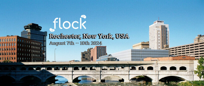
We are thrilled to announce the launch of the new Flock to Fedora website! Designed for both new and existing contributors, the site offers a streamlined experience with improved accessibility, mobile responsiveness, and a cohesive look that matches the main Fedora Project website. The new website is now available at fedoraproject.org/flock. Information specific to this year’s conference is located at fedoraproject.org/flock/2024.
Introduction: Why did we do this?
After settling into my internship with Fedora, and completing a few smaller event automation projects, I was encouraged by my team to try a larger project.
At the start of my internship, the flocktofedora.org website had just been updated with the 2024 call for proposals. Overall, the website was usable, but the design had a very gray, “wall of text” feel to it. This, combined with small inconsistencies in how the page was formatted, could easily lead newcomers to believe that the site was uninviting or not up to date. At that time the site was (largely) being kept up to date by people like Justin W. Flory and Amy Marrich. However, there were a few areas where information was obviously not current. One area was how the site said that registration information was “coming in May 2024” and stayed that way until early July.
In the Summer of 2022, efforts to redesign the Fedora Project website began. This included the Flock website. The goal of this redesign was to unify all of Fedora’s websites under one common design language and introduce a content management system (CMS). This CMS separates content updates from structural website changes, allowing people without web development experience to make content-only changes. The Fedora Project website migration was completed and published to fedoraproject.org. However, the new Flock pages remained a design preview. The original Flock website continued to be the primary place conference information was communicated.
The new site: What changed?
Having two separate web pages for the same thing, both incomplete in their own ways, is what I sought to change as part of this intern project. Now, with less than a week to go before Flock 2024, I’m excited to share the fruits of the seeds planted back in mid-June. Here is what is new:
- Unified Design: The site now aligns with the Fedora Project’s design language, creating a more consistent user experience.
- Enhanced User Experience: We’ve divided the content into two pages:
- Main Page: Focuses on attracting new contributors with a visually appealing overview of the Flock experience.
- Year-Specific Page: Provides essential information like dates, location, and logistics for current year attendees.
- Mobile-Friendly Layout: The new website adapts seamlessly to smaller screens, ensuring easy access on the go.
- Simplified Content Management: Updates are easier than ever with the DecapCMS content management system.
The new website comes with added benefits like improved accessibility for users with disabilities and dark mode for enhanced readability. The new website is far more consistent in its use of community translations. One thing that did not change during this upgrade is the translation interface itself. This interface is available at https://translate.fedoraproject.org. It allows community members to be part of a collective effort to translate content across all of Fedora’s websites and documentation. These community translations provide support for dozens of languages across Fedora without any requirement for web design or programming experience on the part of the community translators.
Our Process: How did we get here?
A month and a half ago, when this project started, I teamed up with a fellow intern, Tosin Adesola. Together, we conducted interviews with a wide variety of stakeholders within the Fedora Project. These interviews included people from Fedora leadership, the Design Team, and people who worked on previous Website redesign efforts. We started off with a template of general questions for each group of people that we interviewed. We combined the responses into a set of user stories and actionable changes that we could make to the website. These were prioritizing based on what we wanted to achieve before the conference.
A series of sprints on the Community Operations intern issue tracker also guided our progress. This was where we timelined out a high-level plan for what we wanted to achieve, working backwards from the date of the conference.
Contributors
The project benefited from the help and support of many different people. Without these people, the process of making these web changes would have been more difficult and may not have happened in time for the conference.
Thank you to the Fedora Websites & Apps Team, in particular Gregory and Francois. You helped provide critical guidance for how to implement the website from a technological and infrastructure point of view. Your feedback was helpful in ensuring that the site functions alongside the existing website infrastructure and the goals of the Websites & Apps Team.
Thank you to everyone who took part in our research interviews. Your responses to our questions helped tremendously. They allowed us to build an overall picture of the needs of the Flock website. This helped inform key decisions such as splitting the site into two pages for two different audiences.
A special shout-out also goes to Ashlyn Knox, who laid a strong design foundation for the entire Fedora Project website. The specific design elements she created for the Flock pages ultimately became a major part of their final design.
Moving forward
We value your feedback! Please share your thoughts on the new website using this form. We are also actively seeking contributions to translate the Flock website content – join the effort at Fedora Weblate.
Visit the New Site:
- Main Flock Page: fedoraproject.org/flock
- Flock 2024 Page: fedoraproject.org/flock/2024
Share your feedback in the survey: Survey form here


